
In order to add some more dimensions than just the linear timeline as in the genealogy of science, I started this project. Inspired by Andrej Karpathys project analysing Twitter feeds and using t-SNE (t-Distributed Stochastic Neighbor Embedding) to visualize thematic clusters of Twitter Users, I started with extracting the text of all 261 Wikipedia pages of persons in the list. Following the recommendation in the reference, TFIDF (term frequency – inverse document frequency) analysis was then applied in order to transform the texts into some quantitative metrics. The same method is used for one of the possible sortings in the Hackathon project on the Gugelmann Collection.
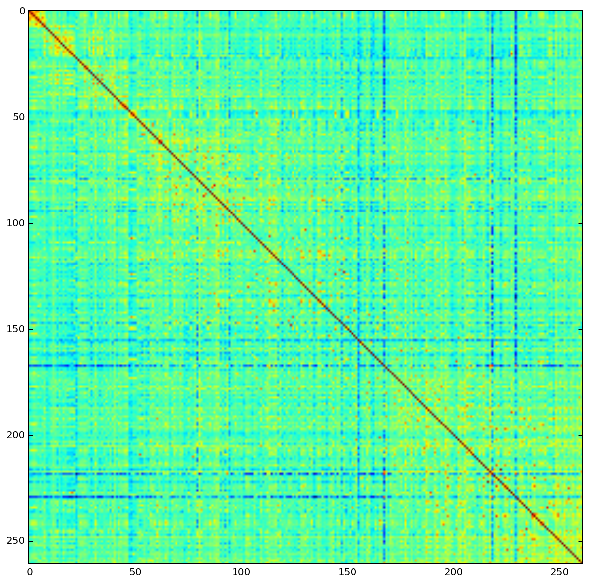
The reciprocal distance matrix looks promising or at least somewhat interesting. A square in the top right corner appears in warm colors, meaning a high degree of similarity among the artices about greek philosophers. The diagonal of the matrix shows all zero values because every article is identical with itself.
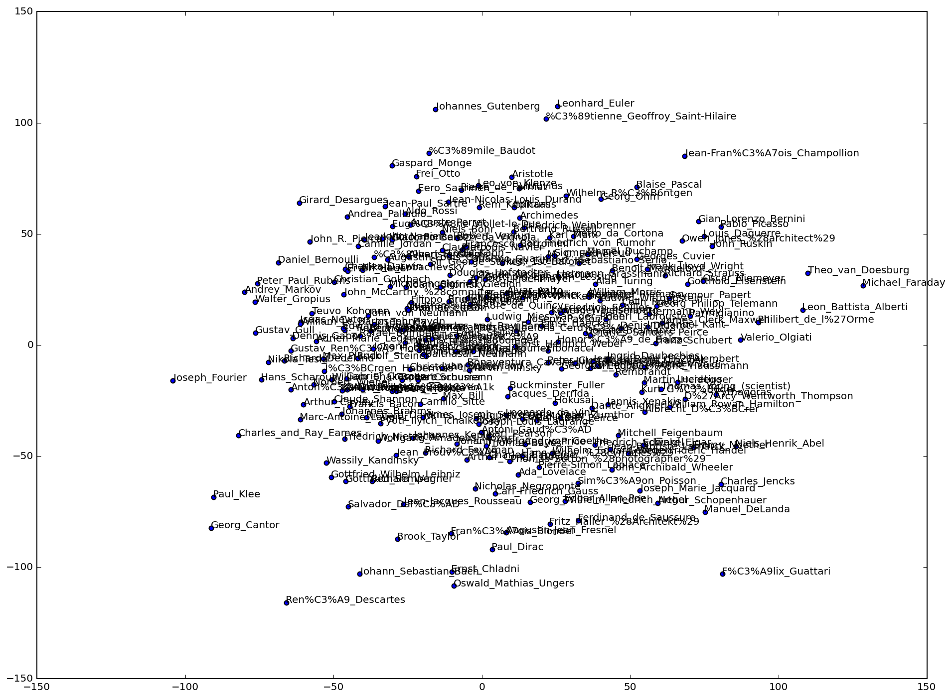
The t-SNE two dimensional embedding however did not bring to light any useful insights. Persons expected to be close together because of similar fields of interest are far appart while unexpected new neighborhoods show up. Before starting to blindly tweak the numerous parameters of t-SNE, testing its functionality with some clearly distinct data seemed a good alternative. For that purpose, the list of english Wikipedia articles was extended with 100 (#100-#199) of their counterparts in german language.

The distance matrix shows two things very strikingly. First, all the german articles have a very high degree of similarity among themselves. The english articles spread over a big range of different distances but are only about half as similar on average. This is mainly if not uniquely due to the removal of english stopwords only.
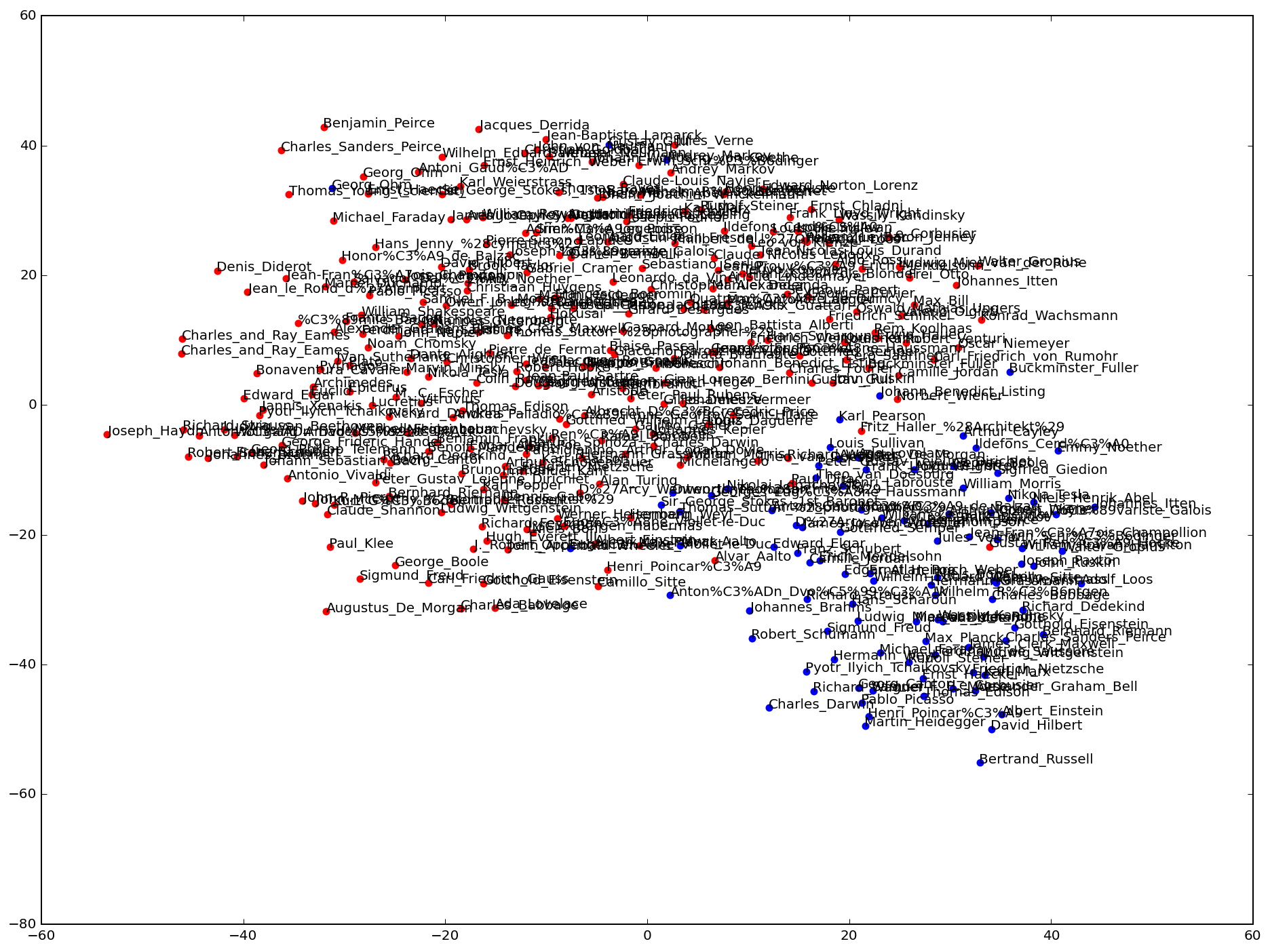
The TSNE mapping on two dimensions then shows that it’s working in principle, clustering the german articles (blue dots) together in the bottom right corner. Having a second closer look on the original inspiration, a similar effect can be observed as well. The most distinguishable clusters are not by topics but – inferred from their user names – by the fact that a substantial part of their tweets is not written in english.
The library in use provides several different dimensionality reduction – or: manifold learning – algorithms. An isomap projection was therefore also fit to the same data (TFIDF distance matrix). The scatter plot below shows this reduction to two dimensions.
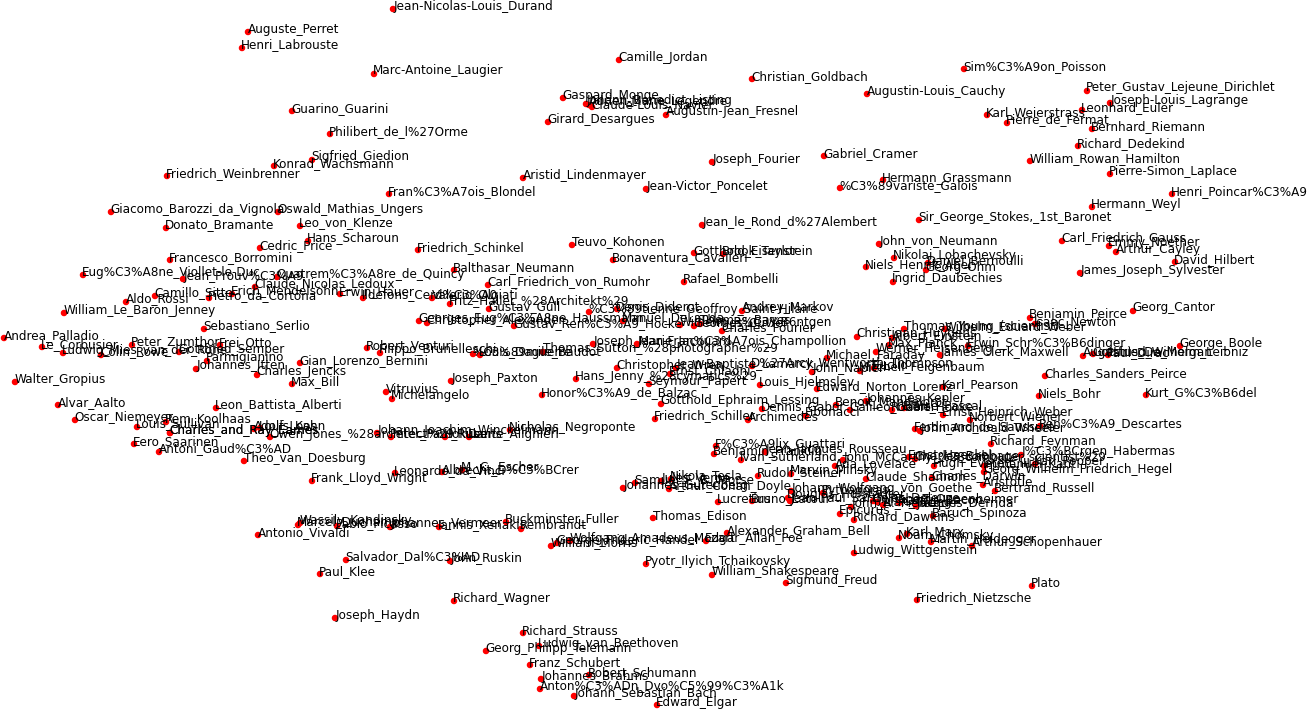
Isomap embedding of TFIDF matrix. Click to enlarge.
This method seems to be more appropriate (or better tuned with default settings) for the task at hand. Composers for example form a cluster at the center bottom, some Bauhaus representatives can be found on the left while a lot of mathematicians occupy the top right corner to name a few. Click the image for more detail.
The iPython notebook that produced these results can be seen here:
nbviewer.ipython.org/url/www.mathiasbernhard.ch/notebooks/wiki_nlp.ipynb
parsing: BeautifulSoup / machine learning: scikit-learn